Every business needs a high-converting homepage to help drive awareness. But if you’re not a designer, how do you go about creating a homepage with engaging copy and design elements that customers love? That will get customers to stick around and buy? In this article, you’ll learn the elements to create a homepage that sells.
How to Build High-Converting Homepage to Drive Awareness
What You’ll Learn:
- Design your own high-converting homepage
- Audit your homepage using the 7-Second Test to make sure it converts quickly and effectively
- Craft a wireframe for your homepage that will set the stage for all traffic driven to your website
Table of Contents
Understand the Purpose and Role of a High-Converting Homepage
Why Homepages Matter
Your homepage has a massive impact on your business… and your company’s bottom line. It’s likely the first impression you’ll make with a prospect, so you need to make sure it’s a good one.
The homepage is your place to…
- Clarify the benefits your product provides
- Establish trust between your customer and your business
- Direct your customers to their next step
This article will walk you step-by-step through the elements of building a homepage that sells. You’ll learn the basic principles for a “sticky” and successful homepage and craft a wireframe for your homepage that will set the stage for all traffic driven to your website.
Let’s get right to it!
Determine Your Target Audience
Download the Customer Avatar Worksheet
To create a homepage that converts, you need to speak to your audience in a way that resonates. The only way to do that is by knowing your target market.
If you’ve been with DigitalMarketer for a while now, you should be familiar with the Customer Avatar Worksheet. This Worksheet acts as a profile of your target market and helps you get clear on who you’re selling to.
If you haven’t filled one out already (or it’s been a while since you last updated it), your first step is to download and fill out the Customer Avatar Worksheet for your target market.

The customer avatar is a cornerstone resource that you will reference again and again as you complete the article, so take the time to gather your data and complete the worksheet. We promise it will be worth it.
We suggest that you have a few different customer avatars, so your marketing messages aren’t too generic. Different people buy your products for different reasons—having more than one customer avatar will help you create a more personalized message that is more likely to resonate with and convert that audience. For instance, at DigitalMarketer, we have 3 different customer avatars.
ACTION ITEM: Complete the Customer Avatar Worksheet.
Determine Your Call to Action
Write Down Your Primary and Secondary Call to Action
On your homepage, your primary call to action (CTA) should be for a Subscribe or Convert stage offer. Remember, your homepage is one of the first places a new customer goes, so you need to assume that most people who are really looking at the homepage don’t know you or your brand well.

Value Journey Worksheet
A common mistake we see is that people will try and jump straight to the Ascend stage with their CTA on their homepage, and that’s essentially proposing on the first date. It’s too much too soon and it’s likely your homepage visitor is going to turn down your CTA. Instead, keep the CTA low risk and high reward for the customer with…
- Entry point offers (AKA tripwire offers)
- Demos
- Email sign-ups
- Free resources (such as Lead Magnets or blog posts)
- Etc.
When it comes to secondary CTA’s, you’ll want to pick an action that provides an alternative to your primary CTA. For example, if your primary CTA is to “take a trial,” a good alternative action would be to “learn more” or “watch a demo video.”
ACTION ITEM: Write down your primary and secondary CTAs for your homepage.
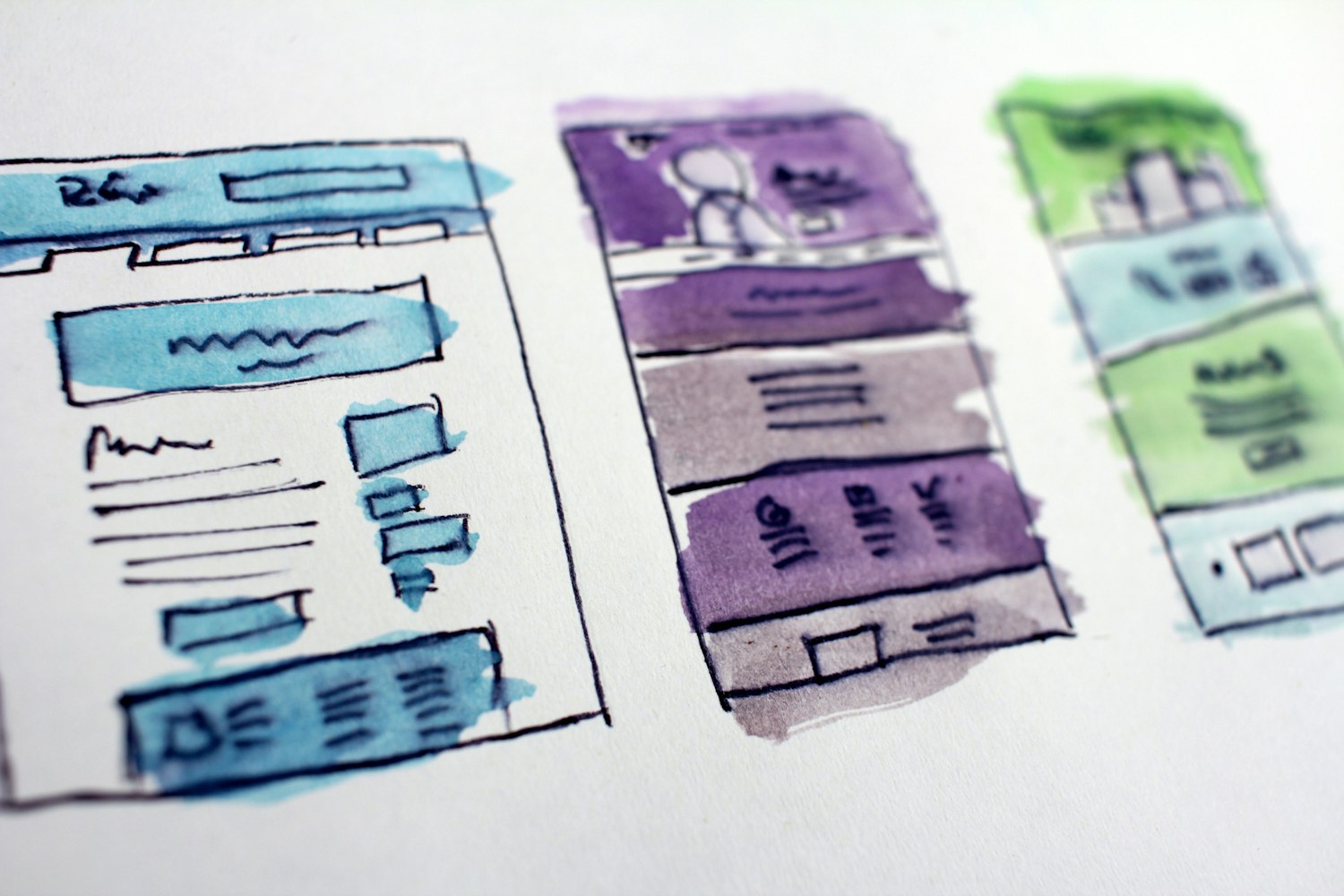
Wireframe Your Homepage
Download the High-Converting Homepage Template
In this module, we will be using the High-Converting Homepage Template to wireframe your homepage. In each section, we will focus on one aspect of the homepage template and provide tips, tricks, and examples.
Keep in Mind: The template has a set order. This is the order that has worked best for us, however, your homepage does not have to follow this exact formula. The best marketers know that testing is your friend! So, try some different options in different orders, and see what works best for you!
ACTION ITEM: Download the High-Converting Homepage Template (in the Resource Section), make a copy of the Google Doc, and fill in the company information section.
Design Your Top Menu
Your top menu is the place your customers will go to learn more. The important things to note about your top menu are…
- Keep it simple. There’s a reason this worksheet only has 3-4 slots to input to different pages. You really don’t want a lot of alternative actions to your CTA
- You want to make sure that the pages you navigate to are further establishing your core message (“About Us” pages usually don’t serve this purpose, so save that page for your footer)
- Keep your Primary CTA on the top right-hand corner of your page (we’ve tested it, and it works!)
For example, CoSchedule does a phenomenal job with their top menu. They have the primary CTA in the top right (“Sign Up Free Now”), and all the menu items are helping to provide more information around signing up. No “About Us” page or other unrelated information.

CoSchedule does a phenomenal job with their top menu. They have the primary CTA in the top right (“Sign Up Free Now”), and all the menu items are helping to provide more information around signing up. No “About Us” page or other unrelated information.
ACTION ITEM: Fill out the menu section…
- Drop-in a link to your logo image
- Write out the 3 navigation pages
- Add in your Primary CTA button in the top right
Grab Your Viewers’ Attention with a Headline and Sub-Headline
The headline on your homepage is arguably the biggest factor in pulling in your audience. It’s the first text they look at, so you want to make sure it’s good.
An effective headline does 2 things really well…
- It positions the customer as the hero and the brand as the guide
- It focuses on the customer experience, not the products themselves
When you are crafting a headline, look back at your Customer Avatar Sheet. Your headline should position your customers moving away from their pain points and toward their desired end goal.
Need some examples? Check out our Homepage Headline Swipe File (in the Resource section). There are a bunch of examples in there you can use for inspiration and some suggested phrasing as well.
ACTION ITEM: Once you’ve decided on your headline, add it to the Homepage Template, along with a sub-headline if you have one.
NOTE: If you do have a sub-headline, make sure you don’t fall into the cutesy trap. It’s become a recent fad to have headlines that are cutesy and attention-grabbing, and then a sub-headline that gets to the central value. The problem: it makes your customer work twice as hard to figure out the value your product/service delivers. We don’t recommend this tactic.
Choose Your Background Image (AKA Your Hero Shot)
The background image behind your headline should serve to further your headline by showing your customers in their desired “after” state. In the after state, their problem has been solved with the help of your product.
Here’s a helpful hint: If you can, put a monochrome overlay over your image, like this one from TrueConversion.

If you can, put a monochrome overlay over your image, like this one from TrueConversion.
When humans see a silhouette of a person (or an unclear image of a person), they instinctively see themselves as the person in that image. It’s called silhouetting, and it can be a powerful tool to help your customers see themselves experiencing a desired emotion/action.
If you’re not sure what image you should use, don’t use an image! You don’t need a hero shot to have a solid homepage. It’s better to keep it simple than give the wrong impression.
ACTION ITEM: Choose your homepage’s background image and determine if you’ll have a hero shot.
Add Your CTA Button
Remember that CTA we had you create in the last module? Here’s another chance to use it!
Go ahead and add your CTA to the button area now. If you have a secondary CTA, you can do 2 side by side buttons.
TIP: Here’s a quick design must-have, you want the primary CTA to stand out as a clear, attention-grabbing action, so make sure the CTA button is a contrasting color. The secondary CTA should be a ghost button, or something close, so it doesn’t steal attention away from the primary CTA.
Create Your Trust Bar
Your trust bar is your place to… well, build trust. You can build trust in a variety of ways, such as…
- Building trust by association with
- Companies you partner with
- Customers you serve if your B2B
- Integration partners if you’re a software company
- Media mentions
- Building trust through proof of knowledge with
- Certifications or awards your company holds
- Building trust through storytelling with
- Customer stories
- Testimonials
Just make sure you ask permission before throwing someone’s logo on your site!
ACTION ITEM: Input your trust-building information as soon as you have permission from your partners/customers.
Add an Explainer Video
This isn’t a required step, but if you have a video sales letter (VSL) or a video that explains the What and the Why of your company, consider including it.
Don’t have a VSL? That’s okay! You can either omit it from your homepage, or you can check out one of our training on it and create your own.
- Script a High-Converting Video Sales Letter Workshop
- Video Sales Letter Script Builder Playbook
ACTION ITEM: If you’re going to include a VSL on your homepage, drop a link to it on your Homepage Template.
Articulate How Your Product Works
This section is pretty self-explanatory… Tell your customer how your product/service works.
Ideally, your process should be between 3-5 steps—if not, try and condense/simplify.
This section should start with a “How It Works” Header and a sub-headline that explains the result of your process. Then, you’ll break down each step in the process with a brief description (3 sentences max!).
Here’s an example from the Praxio website:
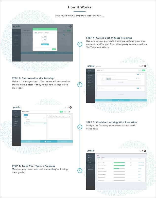
Here’s an example from the Praxio website
It’s okay to let your designer get creative with this section. If someone is scrolling below the fold, they are looking for more info, so a creative design could help keep them engaged with the page longer!
ACTION ITEM: Write your “How It Works” section. Remember to keep it simple and bite-size.
Call Out to Your Customer Avatars
The “Who It’s For” section is designed to draw in your target customers.
Using your Customer Avatar Worksheet as a guide, write out the names of your different avatars, and a use-case for each avatar that will help them identify why they should use your product/service.
Here’s an example from the DigitalMarketer website:

Here’s an example from the DigitalMarketer website.
Each section breaks down one of our customer avatars and points them toward a product that would be right for them. This helps drive each of our avatars to information that applies directly to their needs, and also siphoning them into their respective funnels.
ACTION ITEM: Write your “Who’s It For” section. Remember to keep it simple and bite-size.
Show Your Customer Their Next Move
Remember in Module 1, we said that one of the roles of a homepage is to show a customer their next step? The CTA is the primary means of addressing this. That’s why you want to provide on your homepage a variety of places where people can take that action. So you’ll want to include your primary CTA in more than one location on your homepage. We’d recommend having it in 2 separate locations. One at the top of the page and one below the fold.
Having another CTA lower down the page makes it easier for a customer to take action. Typically, a customer who scrolls down is one who wanted more information before they decide to convert, so give them a place at the bottom where they can convert, rather than having to scroll all the way back up.
Here’s an example from BadYogi, an online Yoga Community. You can see that their CTA is to sign up for their email list. They conveniently add this simple sign-up CTA at the bottom of the page.
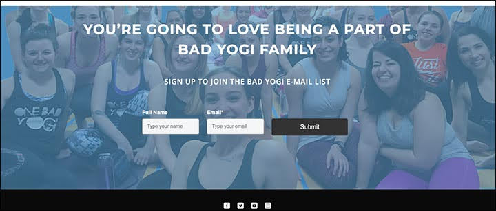
Here’s an example from BadYogi, an online Yoga Community. You can see that their CTA is to sign up for their email list. They conveniently add this simple sign-up CTA at the bottom of the page.
This area can house a short form opt-in menu (essential information only!), an email sign-up, a phone number to call, etc… This is your last-ditch effort to get the viewer to convert, so make it easy for them and remove any obstacles in their way!
ACTION ITEM: Determine the CTA you’ll include below the fold.
Finish with a Tailored Footer
The Footer serves 2 basic purposes:
- A location for any required information, such as the Privacy Policy, Terms of Service, physical address, copyright statement, Contact Us, etc.
- A location to put any extra content for extra curious minds. Think: flagship content, social links, expanded navigation, and case studies
The DigitalMarketer website footer is chock full of helpful info along-side the essential required information. You’ll notice, we have some of our top-performing Lead Magnets linked under topics as well.

The DigitalMarketer website footer is chock full of helpful info along-side the essential required information. You’ll notice, we have some of our top-performing Lead Magnets linked under topics as well.
ACTION ITEM: Determine which extra links you’ll include in the footer section of your homepage. Fill it in on the Template.
Choose a Design
Here’s the thing…
Chances are, you’re not a design wiz and that’s okay! Your homepage doesn’t have to be a crazy feat of design magic.
Just remember to start simple. The Homepage Template gives you some design cues to help you along the way, and you can always offshore the design to a freelance designer or a designer on your team.
If you give someone your finished Homepage Template, they should be able to design and code your website quickly.
If you’re really getting stuck, look at examples of other homepages! Grab screenshots of ones you like and send them to your design team with your template. Just be sure you don’t copy anyone’s work.
You can also use a theme, just remember to keep it simple.
At the end of the day, your design needs to reinforce and support your copy, because the copy is the most important aspect of your page, not the design.
Audit and Optimize Your Homepage
Run the 7-Second Test
Seven Seconds… Your homepage should be able to convey what you do and the value you’ll bring to someone within 7 seconds or you’re likely to lose customers.
So how do you know if your homepage is ready? Find someone and have them take the 7-Second Test.
Here’s how to execute the 7-Second Test:
- Find a person who doesn’t know a lot about your company and ask them if they can help you out by running a quick test. Truthfully, find someone that will give you honest and pointed feedback otherwise you will not get the feedback needed to optimize your homepage.
- Ask them to pretend they are your customer avatar. Explain the role to them (“you’re an HR professional and you…”) and provide a bit of context if they are unsure of the roll
- Show them your homepage for only 7 seconds. That’s it. (Try the test on your desktop and mobile site)
- Ask for feedback on the site. Specifically, these questions:
- What do we do?
- What problem do we solve?
- What action do we want you to take?
- Write down your key insights and action items. If you find that people can’t answer the feedback questions, or if they are giving you a different answer than you want, figure out where the disconnect is happening and what you need to change
- Repeat. You should run this test a minimum of 10 times so you get a clear indication of where all your missteps and points of confusion are. Mistakes are inevitable, but the key is to learn from them!
Download the 7-Point Homepage Audit
Your final step is to download and use The 7-Point Homepage Audit. Use the Audit to see what sort of grade your homepage would get. Would it pass or fail? This will help you determine weak points on your homepage that the 7-Second Test might miss, so you can take the steps needed to fix these weak spots.
We recommend you audit your homepage as it currently stands and periodically come back to this audit as you make changes to your page.
Run the Play
It is often said that “You only get one chance to make a first impression.” This is why when someone shows up to view your homepage you need to make the best first impression possible in about 7 seconds. Don’t let your CTA get lost in the noise. Have a clean and concise homepage.
For this “Run the Play” section, we are going to focus on three separate phases: Plan, Build, and Launch. While the Build section of this checklist will take a majority of your time (and some consider the most fun) it’s important to understand that the Plan and Launch section of this checklist will be CRUCIAL to your Homepage Builder success.