If you are selling products/services online, you need a killer product page. Justin Rondeau will teach you how to show off, educate, and convince your customers that they need your product, and they should buy from you. You’ll learn a variety of page layouts you can apply and the must-have page elements your landing page needs to succeed.
How to Build Product Page to Sell Online
What You’ll Learn
- Build a product page that will display, educate, and convince your prospects that they need your product and need to buy it from you
- Discover a strategy to take your current product pages to the next level by optimizing them with these 12 essential product page elements
Table of Contents
Table of contents
Your Product Pages Really Matter
You Should Start Optimizing Your Product Pages
Understand the 6 Important Questions
12 Elements You Need on Your Product Page
Use Copy on Your Page
Use Images to Make the Product Come to Life
Use Ratings, Reviews, and Testimonials to Build Trust
Have a Clear and Engaging CTA
Decide How to Showcase Your Price
Use Live Chat if You Can Support It
Ensure Your Modifications are Conveyed on The Site
Denote When Your Product is Out of Stock
Use Video to Convey Information
Take Advantage of Bundles, Cross-Sells, and Up-Sells
Use Badges and Icons to Draw Attention to Important Information
Use Dynamic Content if You are Selling Internationally
Use Page Design to Help Prioritize Customers Questions
Use Design to Your Advantage
Use the Typical Ecommerce Layout
Use the Single Product Feature Page
Utilize Comparison Product Pages
Bring Your Product Page to Life
Build Out Your Page
Your Product Pages Really Matter
You Should Start Optimizing Your Product Pages
If you are selling anything online, you should already have a product page live. But how optimized is your page?
Just having the name of your product and the price is not enough anymore. Successful businesses know that your product page is one of the most important pages on your site for your customer—after all, it’s one of the last places your customer will be when they decide to buy your product, or not.
This article will guide you in reviewing the essential aspects every product page should have and how to use those elements to help answer the 6 important questions every customer has when looking at products online. You will also learn how to organize your page in a way that emphasizes the information that matters the most to your customers.
Understand the 6 Important Questions
Regardless of the products or services you are selling, there are a few critical questions that every customer asks when looking at purchasing a product online.
- What does the product look like? People only buy what they can see. If your page doesn’t show your product, your customers won’t buy.
- How does it work? Businesses often overlook explaining how the product works. Remember: just because you, the creator, know how the product works, that doesn’t mean your customers will know how the product works, or how they can use it in their own lives.
- How big or small is it? Size really matters in online shopping. Customers don’t always remember to look at how big or small a product is, but they will be upset if it doesn’t meet their expectations. Conveying the size of products will help prevent your customers from purchasing something they may not be able to use.
- Can it be delivered, by when, and how much will it cost? With 2-day shipping becoming the new norm thanks to Amazon, you must convey shipping expectations to the customer before they purchase.
- Am I able to return it? Again, like the delivery question, preemptively answering questions about your return policy will only help your customers make a more informed decision and save your customer service workers time they otherwise would have spent answering these questions.
- How can I trust this brand? Answering these 5 questions will help to build transparency, and thus trust, but you have to go a bit further. Your customer needs to know you’re a real company, and that they can trust that they will receive what they are purchasing.
Now that you know a bit about the 6 important questions, let’s dive deeper into the 12 essential elements of a product page and learn how you can use these elements to help answer the 6 questions…
12 Elements You Need on Your Product Page
Use Copy on Your Page
Copy is the biggest powerhouse element that will help address all 6 of the critical question’s customers ask.
There are a few important Copy elements you should include on your page:
- Headline: Stick to something short that includes your product name. Don’t get too cutesy, because clever headlines create ambiguity, and ambiguity is killing clarity.
- Descriptive Copy: This is the copy that usually lives under your headline. You should include product details, size specifications, and all the other essential features go. Remember to be as clear and descriptive as possible, without getting too wordy.
- Guarantees: This is where you help to answer questions about your shipping information, return policy, and other product guarantees. Having guarantees will also help to build trust with your customer.
Here are some other must-have features of your copy:
- Use your copy to differentiate yourself
- Focus on the benefit your customers will get from using your product/service. An easy way to start doing this is an ad “so that you can….” To the end of your product features. This helps you hit on the benefit those features will bring to your customer.
- Use personal pronouns to help the customer identify with the product and start to feel a sense of ownership.
- When appropriate, use relative and emotive language to help build a connection between your customer and your product.
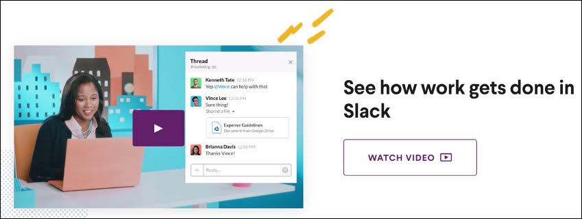
Let’s look at an example from Slack:
You’ll notice here that Slacks’ headline gives a clear definition of what the software is (a collaboration software) and how it will help customers (work together).

You’ll notice here that Slacks’ headline gives a clear definition of what the software is (a collaboration software) and how it will help customers (work together).
The descriptive copy does a great job explaining the features and benefits of bite-sized bunches of copy throughout the page. The sub-headline also hits on the benefit of using Slack, as opposed to other software in the industry.

The descriptive copy does a great job explaining the features and benefits of bite-sized bunches of copy throughout the page. The sub-headline also hits on the benefit of using Slack, as opposed to other software in the industry.
Bonobos take a different approach with their copy…
Notice how there is very little copy on the page?

Notice how there is very little copy on the page?
When it comes to more tangible products, like clothing, seeing is better than reading; That’s why most of the space above the fold is dedicated to the images.
When relying heavily on images, you must title your images and include descriptive meta text for images; that way someone with a seeing impairment can get a clear mental image of your product when the meta text is dictated to them.
ACTION ITEM: Take some time to write out the copy for your product page.
Let’s take a look at images next…
Use Images to Make the Product Come to Life
Images are almost as powerful as a copy. They help to answer the majority of the essential questions, except delivery and return information (sure, you can create icons for that information, but in the end, you will need some copy to answer those questions).
When it comes to images, here are some things to keep in mind:
- High-Resolution Images are a must! There’s nothing worse than blurry images on a page.
- Make images zoomable so that customers can see the details. This is helpful for older customers, or those with difficulty seeing. Using options like click-to-zoom or zoom-on-hover helps save space on the page while also allowing customers to get a closer look.
- Have a variety of images from different angles (especially if you are selling clothing). Giving a 360 view of your product really helps to give your customers a clear understanding of what they can expect out of your product.
- Include images of the product in-use. Showing your product being used will help put your product into context. This helps answer questions about size and product usability, but it also provides an opportunity for you to use some persuasion by showing the product in a positive light with smiling customers using the product as intended.
Keep your images at the forefront of your site (above the fold or better yet, breaking the fold) to help build trust, and grab attention.
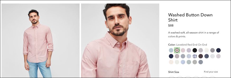
Notice how Bonobos puts the image right at the top and provides a ton of pictures showing different angles of the shirt as well as displaying how it looks on. They also use a type of image preview so that people can scroll through the different images with ease.

Notice how Bonobos puts the image right at the top and provides a ton of pictures showing different angles of the shirt as well as displaying how it looks on. They also use a type of image preview so that people can scroll through the different images with ease.
For products that are not physical, things like product demos or images of the User Interface are a great way to display your product. Slack provides a ton of images throughout the product page showing different aspects of the software.
The first image shows the main display page for the software inside a computer and phone. This clearly tells the customer that Slack is software and not a physical product.

The first image shows the main display page for the software inside a computer and phone. This clearly tells the customer that Slack is software and not a physical product.
ACTION ITEM: Write down some ideas for different images you want to showcase on your product page.
Use Ratings, Reviews, and Testimonials to Build Trust
Highlighting ratings and testimonials on your site can be really impactful on building trust with your customers. Seeing other people’s honest reviews of your product can help customers to let them know you are a legitimate company with tons of happy customers. People will trust other people before they will trust a company, so use social proof to your advantage.
Reviews in particular will help answer some other questions customers have because oftentimes, customers will include things like product descriptions, sizing, and even images in their reviews.
Both Bonobos and Slack use reviews, ratings, and testimonials in their product pages.

Both Bonobos and Slack use reviews, ratings, and testimonials in their product pages.

Both Bonobos and Slack use reviews, ratings, and testimonials in their product pages.
Some things to note when using reviews/ratings:
- Share the total number of ratings if you can. This helps put ratings into context.
- Ensure the reviews are from verified buyers. Spam reviews look bad for your brand.
- Don’t discount negative reviews. Negative reviews help to humanize your brand, and also give you a chance to showcase great customer service through how you react to a negative review (can you give a refund, do you thank them for their feedback, etc.).
As for testimonials, make sure to get permission before throwing someone’s name/logo on your website.
ACTION ITEM: Double check that you have the means to collect ratings and reviews for your products and gather a few testimonials from happy customers.
Have a Clear and Engaging CTA
CTA’s are an important part of the product page, even though they don’t answer any of the critical 6 questions.
Great CTA’s have 2 essential aspects:
- They are clear: If clicking the button adds the products to the cart, say “Add to Cart”; if it automatically takes people to a check out page, say “Buy Now”. Being clear about the action a customer is going to take helps clear up any confusion.
- They validate action: CTA’s that change color when customers have checked all the options are way more engaging than a static button. Likewise, CTA’s that trigger an action (say, a number showing up next to the cart to confirm that you did add the item) also help customers know the action was taken.
- They stand out: Keeping the CTA above the fold and in a contrasting color helps draw attention to the action.
ACTION ITEM: Write down your CTA copy, decide on a color, and dictate what action you want that CTA to accomplish.
Decide How to Showcase Your Price
When it comes to putting your price on your product page, there are 2 ways you can go about it.
- Loud and Proud: Showcase your price and make it well known. Most eCommerce brands will use this approach
- Keep it Quiet: Some luxury brands or expensive SASS brands will keep the price very small or even on a different page. This tactic really only works for people who don’t really care about the price, so keep your target market in mind when deciding on this choice.
Another tactic you can use around price is to cross through older prices when you are having sales and highlight the new price, as well as the discount percentage.
ACTION ITEM: Decide which tactic you want to use to showcase your price.
Use Live Chat if You Can Support It
Live chat is a great resource for customers to help them answer all 6 of the critical questions.
While the feature is great, it’s really only helpful if you can support it. However, it can quickly become an annoyance to customers if they don’t get quick, clear responses from people.
If you can support the service, it is a great way to gain insights into customers’ questions and also provides a perfect place to upsell/down-sell to customers when applicable, to provide a better product fit for customers.
ACTION ITEM: Decide if live chat is a feature you can support on your page.
Ensure Your Modifications are Conveyed on The Site
For products that have different sizes, colors, shapes, features, etc. it’s important that when a customer modifies their order, it shows up on the product page.
Bonobo does this by changing out the images when you choose a different color option.

Bonobo does this by changing out the images when you choose a different color option.
Bonobo does this by changing out the images when you choose a different color option.
Other brands will even go so far as to change out the models wearing the product to match the sizing the customer chose so that they get a more accurate representation of how the product will look and fit on their body type.
Having things like size charts also help customers make more informed decisions.
ACTION ITEM: Take note of any modifications you may need to highlight on your product page.
Denote When Your Product is Out of Stock
It is crucial that you denote when your products are in stock, and also when they are out of stock. There’s nothing worse for a customer than purchasing your product, only to find out later that there is no more inventory.
Disqualifying customers that want something you don’t have is just as important as qualifying customers who want what you do have.
Bonobos do this by putting a line through sizes and colors that are out of stock.
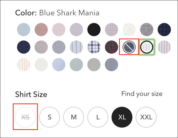
Disqualifying customers that want something you don’t have is just as important as qualifying customers who want what you do have.
This does require a lot of work on the back end of your site, but it’s worthwhile.
ACTION ITEM: Make sure the back end of your site is configured so that you can be up to date on your inventory.
Use Video to Convey Information
Videos are another juggernaut for conveying information and can help answer all 6 of the critical questions that customers ask.
Video is a far more engaging medium to help convey information about product features, use-cases, product size and look, and even more. You can use video to show 360 views of your products, demos of software or other not-physical products, and examples of products in use.
VSL’s (Video Sales Letters) are often used for training or seminars to highlight the instructor and help give insights into the training.
Slack takes advantage of product demos on their page as well.
Slack takes advantage of product demos on their page as well.
Some things to note about using video:
- It can be expensive to produce, so make sure you can support the cost.
- You should rarely have the videos auto-play, but when you do, they should always auto-mute.
ACTION ITEM: Decide if including videos is right for your product page, and your business.
Take Advantage of Bundles, Cross-Sells, and Up-Sells
If you aren’t already, you should be taking advantage of product page features that allow you to highlight similar products. This is a great way to increase average order value, while also increasing the value your customer gets from your site.
Bonobos do this underneath their featured product…

Bonobos do this underneath their featured product…
If you have a long-form sales page for a product, it’s best to wait to cross-sell until after that purchase has been made, as cross sells distracts customers from the main product.
ACTION ITEM: Determine if cross-selling/up-selling is applicable on your product page and decide what products/offer you will make.
Use Badges and Icons to Draw Attention to Important Information
Badges and icons are great design features that can help draw customers’ attention to important details on your page or push them in the right direction towards specific products or pricing options.
There are a ton of different types of badges you can use on your page:
- Trust Seals
- Payments Accepted
- New Product
- Sale Product
- Low Stock Product
- Local Product
Badging and Icons are super helpful, but you don’t want to make your customers think too hard about the graphics, so make sure they are accompanied by copy.
Here’s an example of badging by Kajabi. They are using the blue badge to highlight one of their pricing options that provide the “Best Value” for their customers.

Here’s an example of badging by Kajabi. They are using the blue badge to highlight one of their pricing options that provide the “Best Value” for their customers.
ACTION ITEM: Make some notes on the different types of badges and icons you could use on your product page.
Use Dynamic Content if You are Selling Internationally
If your company has customers across a variety of countries, you must have dynamic content that adjusts to the geographic location your customers are selling in.
The Geographic information that would be affected are…
- Price Display: your prices need to reflect the currency used in that area, and the price itself may also change with exchange rates.
- VAT & Other Taxes: different countries have different laws around where and how you include taxes in your price displays. If you are selling in a different country, you should familiarize yourself with their merchant rules and regulations.
- Shipping Availability and Cost: Your customers should have accurate shipping timelines/pricing for your products so it can be helpful to specify your shipping timelines to the different geographic locations.
- Language: Your customers shouldn’t have to do the hard work of translating your website content. You should set your site up so that it matches the language used on the customer’s web browser.
While most of these changes will require help from your web developer and a Geo IP tool, they are important changes that can make a huge difference if you sell in other countries.
H&M does a great job accommodating buyers from around the globe. Changing your location affects prices, language, shipping expectations, and even accommodates local markets with specialized offers.

H&M does a great job accommodating buyers from around the globe. Changing your location affects prices, language, shipping expectations, and even accommodates local markets with specialized offers.
ACTION ITEM: Decide if you need to create some dynamic content for your product page so that it works with the markets you are selling to.
At this point, we have now gone through all 12 of the essential elements of every product page, and how they help to answer questions customers commonly ask. Next, let’s go over how to use page design to help answer customers’ questions effectively.
Use Page Design to Help Prioritize Customers Questions
Use Design to Your Advantage
When it comes to designing your product page, you want to make sure your design is working in service of the information you are trying to highlight.
Remember the 6 key questions talked about in module 1? Ideally, you should answer all 6 of these questions 1 time above the fold, and around 3 times throughout the page (depending on length). However, in some cases, you may leave certain elements visible below the page to help draw attention and action.
Let’s look at examples of 3 different types of product pages, and how to use that layout to help answer your customer’s core questions…
Use the Typical Ecommerce Layout
When you think of a typical product page, a standard eCommerce page is typically what comes to mind. Ecommerce layouts are pretty standard in general, but different brands put their own spins on the pages.
Take Glossier, for instance. As a makeup eCommerce Brand, they chose to prioritize information on the product such as: what it looks like, how it works, some important information on the product that sets it apart from other makeup brands, amount of product, and reviews.

Take Glossier, for instance. As a makeup eCommerce Brand, they chose to prioritize information on the product such as: what it looks like, how it works, some important information on the product that sets it apart from other makeup brands, amount of product, and reviews.
The price is listed below the fold, which means that the brand wants to give you all the information on the product before they show you the price. Usually, this means that the price isn’t the driving factor behind a customer purchasing a product.
Amazon, on the other hand, knows that price and shipping are huge factors that influence purchasing behavior for their customers. They make a point to highlight the price and the shipping timeline above the fold.

Amazon, on the other hand, knows that price and shipping are huge factors that influence purchasing behavior for their customers. They make a point to highlight the price and the shipping timeline above the fold.
As you can see, even with a product page that looks very similar, tailoring the content to help draw attention to the things that are important to your customer will help increase sales.
Next, let’s look at the single product feature page.
Use the Single Product Feature Page
The second type of product page you can take advantage of is the single product feature page. This page is highly customized and great for single products or small product lines.
You might be familiar with this page if you’ve been on DM’s site. We use single product feature pages to sell our different products.
Let’s take a look at an example of one of DM’s pages.
Above the fold, you can see that there isn’t a whole lot of copy about the certification, except for a brief headline and sub-headline. However, the price and CTA are easily viewable for people who don’t need a lot of convincing.

Above the fold, you can see that there isn’t a whole lot of copy about the certification, except for a brief headline and sub-headline. However, the price and CTA are easily viewable for people who don’t need a lot of convincing.
The element that takes up the most space is the video. This was purposeful, as the video gives all the essential information about the certification, and also features the CEO Ryan Deiss. By putting a high-powered expert front and center, it helps to build authority and ensure customers that the product holds up to a high standard.
The page also includes graphics that show what the certification will look like.

The page also includes graphics that show what the certification will look like.
You want to make sure that you make your inanimate products feel as real and tangible as possible. Alternatively, if you’re selling a physical product, you want to use copy and images to make the product seem larger than life.
Finally, Let’s review the last type of product page.
Utilize Comparison Product Pages
Comparison pages are often used when you have a line of products that are pretty similar to one another. Because this page is more centered on showing particular features, its typically used by brands that are more defined and well known in the market, so that less time is spent convincing customers to buy a product, and more time helping customers decide which of the different products is the best choice for them.
Apple is a company that is already well established, so they often use comparison pages to showcase different products.
Their side-by-side comparisons allow customers to choose different models of iPhone to compare and provides a list of specs below on how each product differs. Since iPhones are partially purchased for aesthetic reasons, color options and an image of the product are highlighted first.

Since iPhones are partially purchased for aesthetic reasons, color options and an image of the product are highlighted first.
This layout can be super beneficial for customers who like having a lot of options but be sure to limit the number of products they can compare at once so that people don’t end up with decision fatigue and forgo purchasing.
Now that you’ve seen all 3 types of product pages, it’s time to decide which page is right for you
ACTION ITEM: Decide which product page will work best to answer your customer’s questions and highlight your product.
Bring Your Product Page to Life
Build Out Your Page
Now that you’ve decided on the product page that will work best, it’s time to build out your new product page (or update your old one).
You can either:
- build the page out yourself
- work with a web designer to build the page
- use a customizable template
Tools such as Webflow, or Elementor to help you build out web pages.
Remember to answer all 6 of the essential question’s multiple times in different places across your page and to layout your page to prioritize answers that matter the most to your customers.
You can also use qualitative data, or A/B testing to help test and optimize different layouts.
With that, it’s time to start building out your page!