Earlier, you learned about tools used to measure webpage performance and improve conversion rates, including heat maps, session recordings, and A/B tests. In this reading, you’ll explore heat maps in more depth, and how they can help you optimize an e-commerce website’s content and organization.
Table of Contents
What is a heat map?
As you’ve already learned, a heat map is a data visualization tool that uses a color scale to represent how visitors interact with an individual webpage. Most heat map tools use a rainbow (or thermal) scale to demonstrate patterns of user behavior across different parts of a page.
A rainbow gradient color scale labeled “cold” at the blue end and “hot” at the red end

Areas of greater focus or engagement are considered “hot” and indicated by colors at the warm end of the scale (e.g., red, orange). That’s why elements with high click or tap rates are known as hotspots. In contrast, areas with less engagement are “cold” and expressed through cool colors (e.g., blue, cyan).
Heat maps are useful tools because they do more than just track metrics. They provide detailed data on how visitors are responding to specific parts of a page. Heat maps can tell you what visitors are reading, where they’re clicking, and what they might be missing entirely. The insights you gain from this data can help you determine how to test or adjust each page to improve the visitor experience and reach performance goals.
Types of heat maps
There are several types of heat maps businesses use to optimize e-commerce websites. Each provides slightly different information, so they are often used together to gain a more detailed understanding of visitor behaviors. In the rest of this reading, you’ll learn how to interpret three common types of heat maps: scroll, click, and hover.
Scroll heat maps
Scroll maps track what percentage of visitors scroll down to specific points on a webpage. They tell you what areas of a page visitors are likely to see, rather than how they respond to individual elements. Often, the “hottest” area is above the fold—the area displayed before scrolling—with the map becoming cooler further down as visitors click away (as in the graphic below).
A scroll heat map with the hottest area at the top of the page
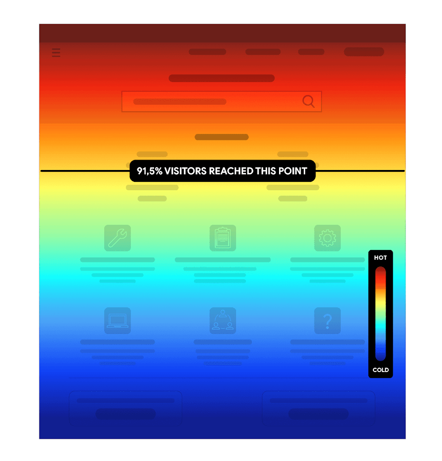
Insights gained from scroll maps allow you to:
- Put key content where it will get the most attention
- Identify false bottoms (places where visitors stop scrolling prematurely because they think the page has ended)
- Propose changes to encourage scrolling (if additional scrolling is the goal)
- Optimize pages for both web and mobile experiences
Click heat maps
Click maps (or touch maps on mobile devices) track where visitors click or tap on a webpage. Clusters of activity appear as blobs, or spots, of color across the page, as shown in the graphic below. This data lets you identify patterns and trends in visitor behavior, which can help you increase future click rates.
A click heat map with irregular spots of color, demonstrating higher and lower engagement with page elements
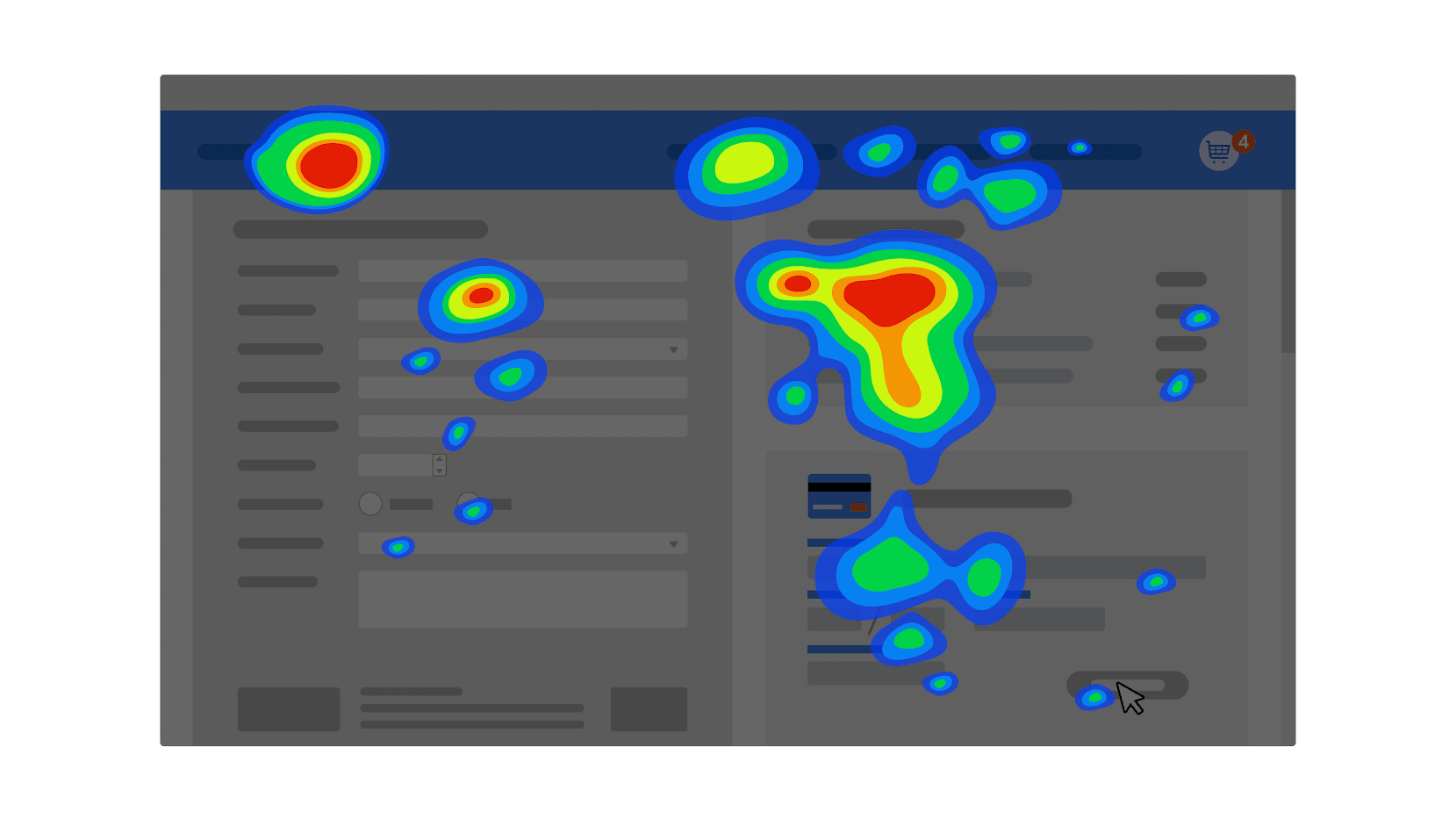
Click maps can tell you if visitors are clicking (or tapping) where you want them to—for example, on certain links or calls to action (CTAs). If a link isn’t getting enough engagement or visitors are clicking unclickable elements, it could mean the page is overcrowded or confusing.
Click map data can also help you:
- Find out which page elements visitors are responding to
- Gauge the effectiveness of your CTAs
- Decide whether to run A/B tests on certain elements
- Clarify page content or structure
Hover heat maps
Engagement can’t always be measured in clicks, particularly when it comes to written or visual content. Hover maps (also known as mouse maps or movement maps) can capture these patterns of visitor attention by tracking mouse movement across a page. Mouse movement isn’t a perfect indicator of attention, but it does provide a sense of where visitors are focusing.
Hover heat map with irregular spots of color, demonstrating differing amounts of attention paid to various parts of the page
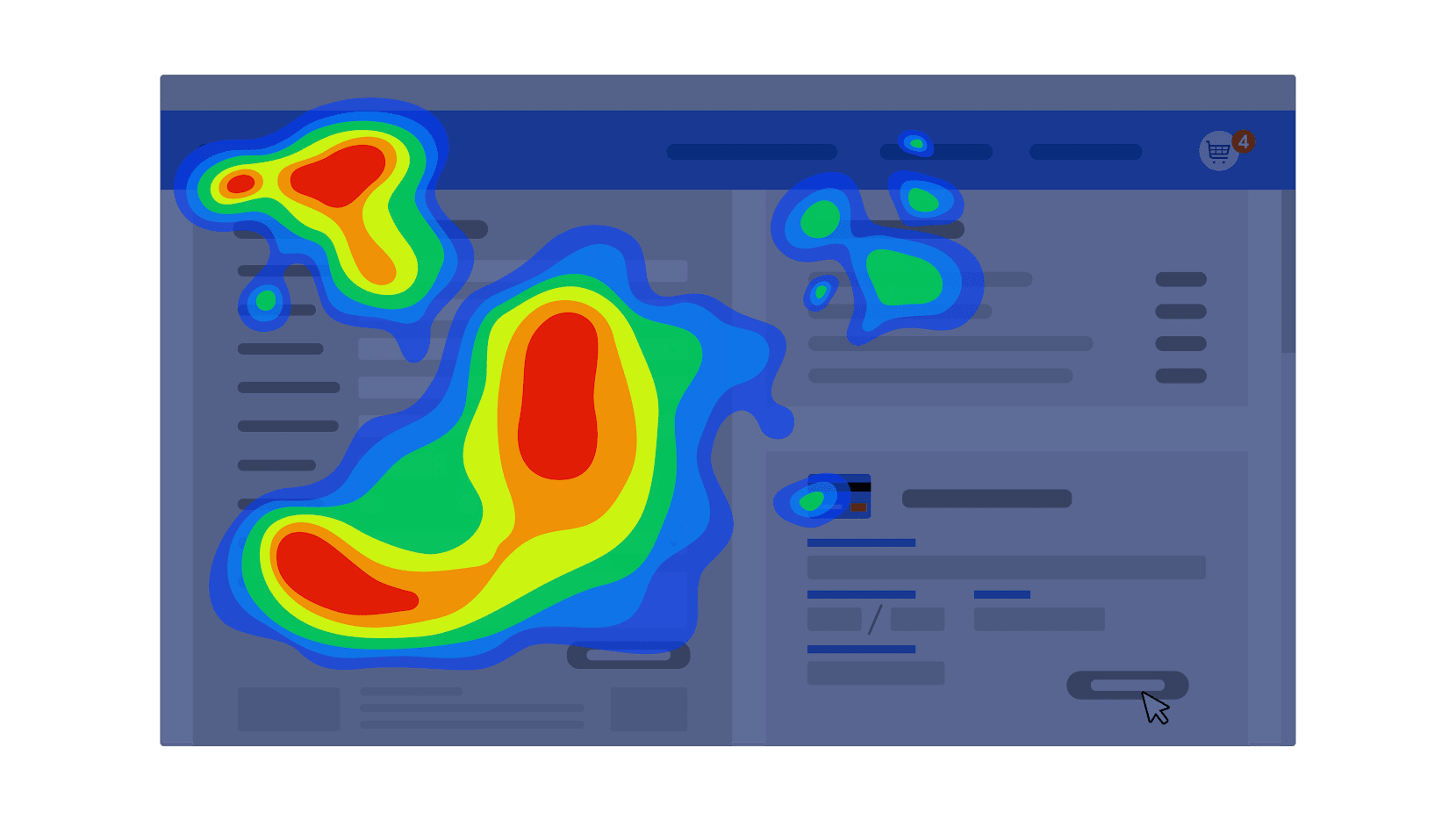
The optimal amount of attention paid to specific elements depends on the goals for a given page. If visitors are focusing on a specific paragraph, that may mean they find it interesting or helpful. However, it could also mean the text is confusing or difficult to read.
Hover maps can help you determine if visitors are:
- Paying attention to the right (or wrong) elements
- Becoming distracted by unimportant page details
- Struggling with page content
Key takeaways
Using metrics to understand visitor behavior can be a challenge. Fortunately, heat map data allows you to understand the impact of specific choices on metrics like clicks and conversions. When used together, scroll, click, and hover maps provide actionable insights to improve performance and help you reach your goals.
Resources for more information
For more on heat maps and what they can do for e-commerce businesses, visit the following resource:
- The complete guide to heatmaps: A history of heatmaps and how they’re used today