When you share data visualizations to help stakeholders consume metrics and data, it’s important for them to be able to scan through them to get the main points in a few seconds. This reading provides examples of when you might need to adjust or regroup data to create a chart that’s easier for stakeholders to read and understand.
Avoid crowded charts
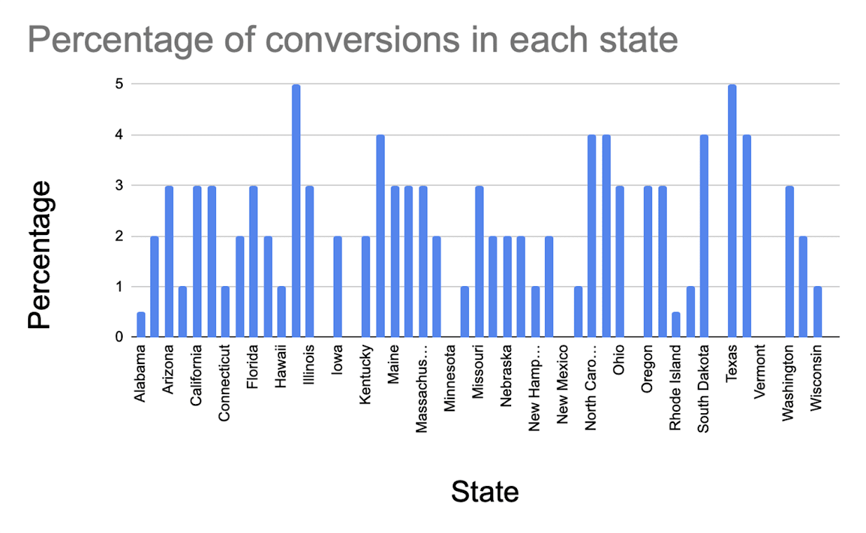
If a chart shows many categories, it can look crowded. For example, suppose you need to show the percentage of conversions in each state in the United States for a national marketing campaign.
A column chart doesn’t have enough room to label the data for all 50 states.
Column chart shows percentage of conversions in each state; not every state is labeled on the x-axis due to space constraints between columns.
A pie chart has too many slices that can’t be clearly labeled and displayed.
Pie chart shows percentage of conversions for each state as 50 pie slices, which is too many to read in a pie chart.

You can create a stacked chart, or reduce the number of categories, to have a more visually appealing chart that’s easier to read.
Create stacked charts by region
If you stick with a column chart, you can group states by region (such as Northeast, Midwest, South, and West). Then, you can create a stacked column chart. Each column cumulatively shows the data for each state in the region. The resulting chart has four instead of 50 columns.
Stacked chart shows percentages by region instead of by state. Four columns display state percentages and are labeled Northeast, Midwest, South, and West.

Display states with most conversions and combine others
If you stick with a pie chart, you can reduce the number of categories. You can show the states with the largest percentages of conversions and put all other states in a grouped category, such as states with less than 3% of conversions. The resulting pie chart has eight instead of 50 slices which is much easier to read.
Pie chart shows slices (percentages) for Idaho, Louisiana, North Carolina, North Dakota, South Dakota, Texas, and Utah, and groups all other states in the largest slice.

Key takeaway
When you create a chart to share with stakeholders, you need to select the most appropriate chart type for your data. Sometimes you have to try different charts to find out which looks the best. Other times you need to adjust the data to create a more visually-appealing chart.
Bonus guide to creating charts
How to choose a data visualization: Refer to this pictorial guide for help selecting the right type of chart for your data. You may download and keep it for reference.