Landing pages are kinda like cakes.
They may look beautiful, but what’s more important is how that sweet bite tastes in your mouth.
The same goes for landing pages. Your landing page may have beautiful, brand-aligned aesthetics… but does it get bites?
If not, it might be lacking the fundamentals that are making the entire conversion journey intuitive and frictionless.
Howie Mann suggests rules of thumb for a smooth user interface design which you can apply to your landing page. Let’s see what he says…
#1 – Use defaults: Believe it or not, too many choices can scare your customer off. Instead, design your landing page to list a few default values or the most important choices.
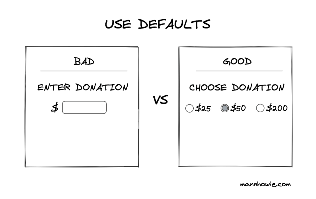
For example, if your product comes in different sizes and colors, add buttons to the most popular ones to remove friction.
#2 – Show progress bar: If there’s an action that requires time, such as calculating shipping fees, creating checkout, or anything similar, make sure you communicate to users that you recognize and appreciate their time.
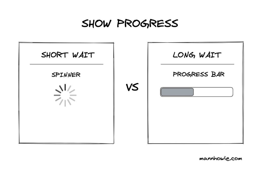
A lot of pages do this by adding a loading bar for shorter loading times, or a progress bar for longer waits so your customers stay on the page and don’t abandon their carts.
#3 – Avoid interruptions: You know the biggest turn off for a customer? Pop-ups and similar interruptions.
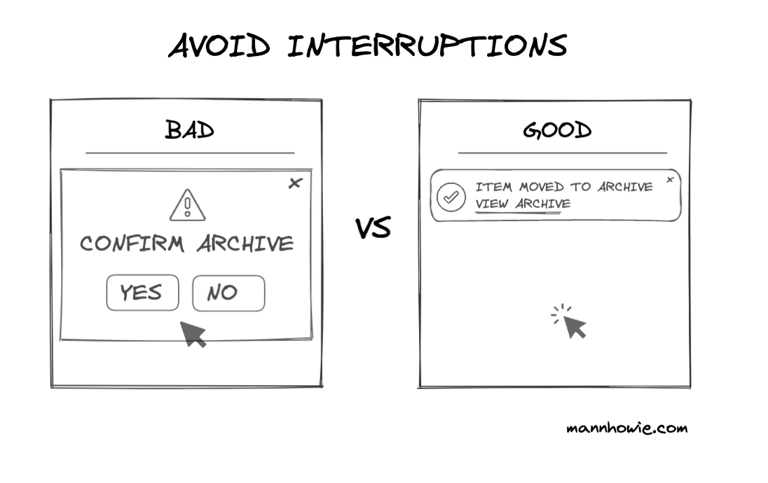
Whenever you can, try using less intrusive models to upsell, recommend items, acquire leads, etc.
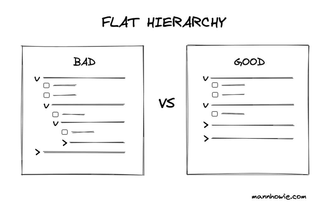
#4 – Use a flat hierarchy: Landing pages should be simple, scroll-through experiences that won’t lead your audience astray with more needless content.
With these, the landing page groundwork is set. After you’ve made it easy to navigate and convert, you can add the brand styles and pretty colors.
Ah, so much better.