While you were organizing the garage and repainting that spare room, Google was doing its own spring cleaning.
The company is testing new designs to make Google Ads more organized and easier to navigate.
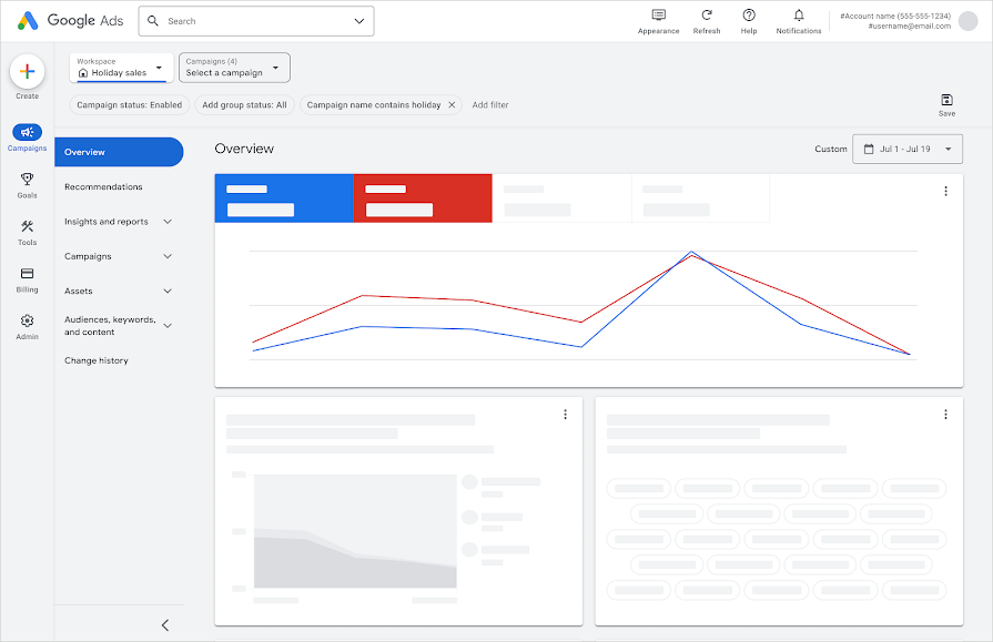
Table of Contents
So fresh and so clean
Google says it won’t change or remove any existing features, but will add a few updates, like…
- A new navigation menu. You may see either a single-level menu or two-level menu in the dashboard, making the navigation more consistent and predictable.
- Reorganized interface. Two new navigation categories, ”goals” and “audiences, keywords, and content” were added, making tools and features easier to find.
- A “refreshed” look. Google Ads now has more white space, less distractions, a new font, and “sleek new icons” on the navigation bar.
When it’s available
Nobody knows. Google says this “experiment will initially roll out to a small number of accounts,” and if successful, will be made available to more users.
Why we care
If the new design improves the user experience and helps us better navigate and manage our ads, then we’re all for it.
Thankfully there are no fundamental changes to the dashboard, so if it rolls out to everyone eventually, it shouldn’t be hard to get used to. One thing less to worry about.